
- This spreadsheet allows you to quickly create professional looking plots of data.
- This spreadsheet is useful for looking for trends and relationships in your data.
- You just paste in the data to the data sheet, name the columns and select which columns you want to plot in the Chart sheet.
- With this spreadsheet it is easy to:
- plot separate series (different colour points) categorized by one of your data fields.
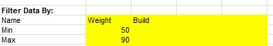
- filter the data you want to plot.
- plot regression lines through the different series.
- plot bin averages for scattered data.
- annotate the data with labels automatically.
Why build a spreadsheet to do do X-Y plotting when this ability already exists in Excel?
I wanted a plotting spreadsheet that has the following features
This spreadsheet is easy to use!
Enter your data for the dependent and independent variables on the sheet named Data. Place the name of the variables in the yellow cells and the data beginning on row 11.
I wanted a plotting spreadsheet that has the following features
- I could easily look at many different dependent and independent variables and could change those easily.
- I could change the data in each series and plot them as a different colour.
- I could easily filter out data to clean up the dataset.
- Plot regression lines for each series and able to plot bin average for better visualization of scattered data.
This spreadsheet is easy to use!
Enter your data for the dependent and independent variables on the sheet named Data. Place the name of the variables in the yellow cells and the data beginning on row 11.

After you paste in new data, press the New Data? button on the Chart sheet. This sets up some formulas.

Use the drop down list and select the X and Y variables. The Z variable is used for the 3D plot on the 3D_CH sheet.

Select if you want to categorize your plot. Select a variable from the drop down list. This variable must be a text string. Each category is shown as a separate series and given a different colour.

Select if you want to filter the data. If you deleted the Name fields, then no filtering will occur.
Click the Update Chart button to refresh the chart. This macro is necessary to sort the data so the series are correct to show the categories of data.

Special Features
Plot Bin Averages. Turn this on by putting a 1 in the "plot Bin Averages" input cell. This will plot a large dot for the mean value of the data within bins. This allows better visualization of the trends of scattered data.
Plot Regression Lines. Turn this on to put a best fit line through each category of data (each series). Good for looking to see whether different categories have the same slope, or are col-linear etc.
XY Scaling. You can set the scaling to automatic or manual, without having to mess with the Excel chart settings.
Data Labels. You can labels each point on the plot with a numeric or text variable. You can also just label 1 point for each category (series).
More detailed instructions are contained on the Instructions sheet within the spreadsheet.
No comments:
Post a Comment